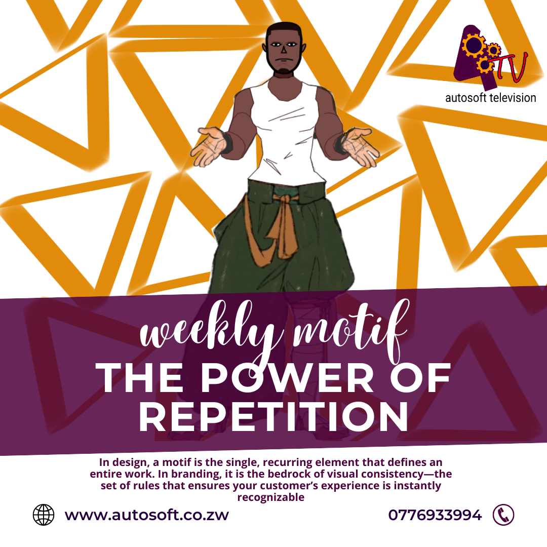
The Silence of the Squares: Why Your Brand’s Color Palette is More Important Than Your Logo
Welcome to The Weekly Motif, where we explore the art, psychology, and technique behind building unforgettable digital brands!
We often pour all our branding energy into the logo. We want it sleek, memorable, and unique. While the logo is your brand’s face, the color palette is its mood, its voice, and its psychological anchor. It speaks volumes before a single shape is recognized or a word is read.
Think of it this way: your logo is the celebrity, but your colors are the atmosphere of the room they walk into. And that atmosphere is doing most of the talking.
1. Color: The Fastest Communication Tool
Humans process visuals up to 60,000 times faster than text. And within that visual processing, color is the instant trigger.
- A flash of Red triggers energy, urgency, or passion (think Coca-Cola or YouTube).
- A wash of Blue evokes trust, security, and tranquility (think banks or Facebook).
- A burst of Yellow suggests optimism, clarity, and warmth (think National Geographic or McDonald’s).
If your brand colors don’t align with the feeling you want to evoke—if your financial advisory service uses aggressive orange and electric green—you create visual dissonance. This confusion erodes trust before your customer even reads your value proposition.
The Motif Tip:
When defining your palette, start with feeling, not fashion. Ask: If my brand were a piece of music, what emotion would it evoke? Then map that emotion to a color.
2. Consistency: The Key to Digital Recognition
In the hyper-saturated digital world, consistency is currency. If your social media posts use one set of colors, your website uses another, and your email marketing uses a third, you are forcing your audience to re-learn who you are every time they encounter you.
A strong, consistent color palette instantly creates brand recognition. When your audience scrolls quickly through their feed, the consistent application of your unique colors acts like a powerful mental shortcut, prompting instant recall of your brand identity.
This applies across all your digital assets: website buttons, social media templates, video lower-thirds, and even your digital art assets. Consistency isn’t boring; it’s professional.
The Motif Tip:
Define a palette of 5-7 specific colors (including neutrals like black/white/grey) and stick to them rigorously. Note the exact HEX codes and share them with every designer, animator, and marketer you work with.
3. Application: Using Color for Digital Marketing Leverage
Beyond basic branding, strategic color use is a massive digital marketing advantage:
- Call-to-Action (CTA) Power: Use a highly contrasting color—your accent color—sparingly and almost exclusively for CTAs (e.g., "Buy Now," "Sign Up," "Contact Us"). This high contrast makes the button "pop" and directs the user’s eye exactly where you want it.
- Data Visualization: When presenting data in infographics or reports, use your primary brand colors to highlight the most important metrics, ensuring your audience instantly grasps the key takeaway that benefits your brand.
- Brand Digital Art: Your creative social posts and banners should leverage the core palette to maintain visual connection while still being artistic and engaging. A well-designed graphic will feel like your brand, even without the logo being huge.
Think of it this way: your logo is the celebrity, but your colors are the atmosphere of the room they walk into. And that atmosphere is doing most of the talking.
Ready to Master Your Visual Voice? Let Autosoft Be Your Palette Guide.
Defining a powerful, strategic color palette and ensuring its perfect execution across all digital platforms is often where brands stumble. It requires both artistic insight and technical precision.
At Autosoft (www.autosoft.co.zw), we specialize in the complete spectrum of visual communication:
- Premium Graphic Design & Branding: We don’t just design beautiful logos; we architect full brand identities, starting with the psychological science behind your perfect color palette.
- Web Development and Design: We ensure your chosen colors are perfectly implemented on your website, maximizing accessibility, user experience, and those all-important conversion rates (CTAs!).
- Digital Marketing Strategy: We teach you how to leverage your brand’s unique visual language to stand out in crowded digital spaces, ensuring every post reinforces your core identity.
- Animations and Video Production: We carry your color story seamlessly into dynamic content, making your videos instantly recognizable.
Stop whispering and start speaking with visual power. Let Autosoft turn your brand’s colors into its most compelling asset.


